Photos for Dating Sites vs Apps: Specs, Crops, and What Converts
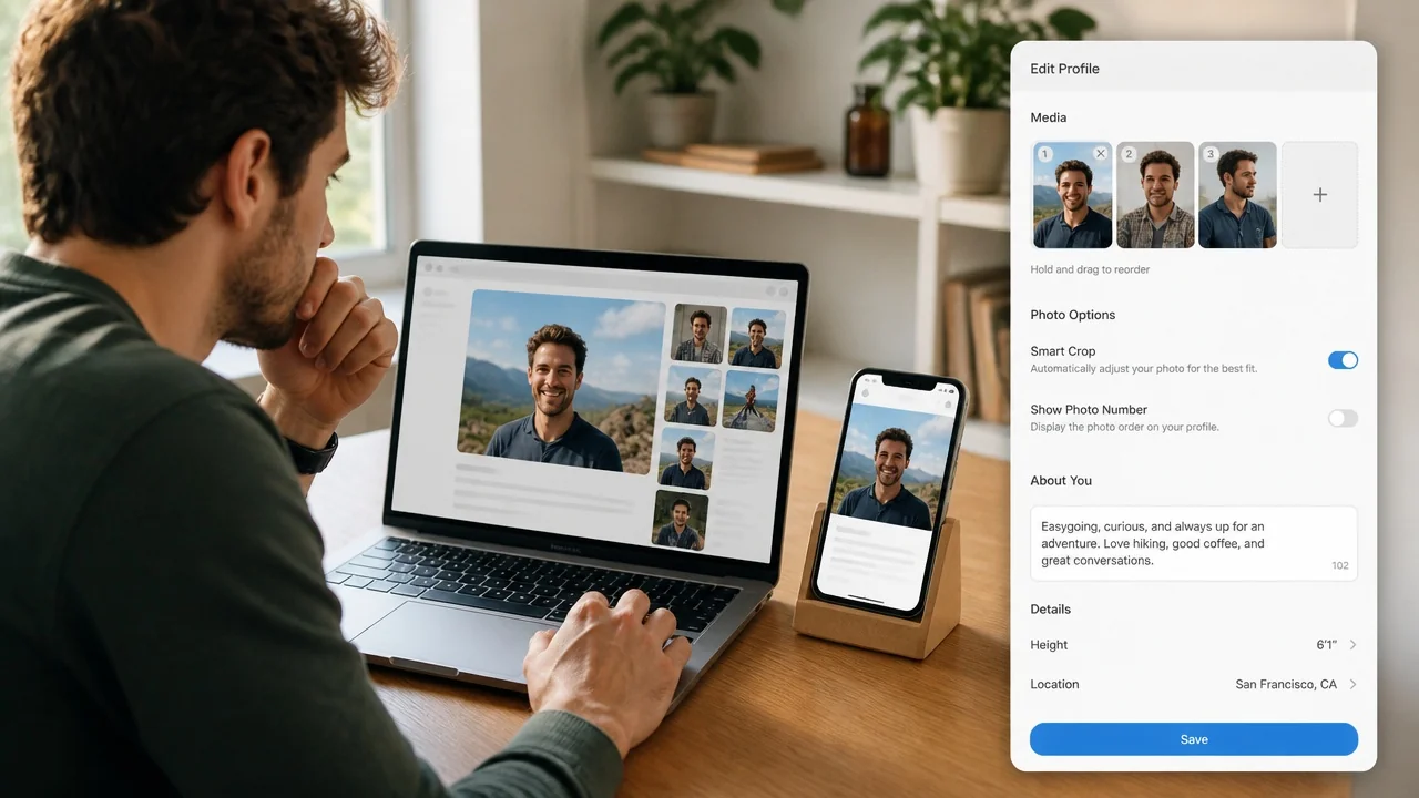
If you're active on both desktop dating sites and mobile apps, here's the short answer: photos for dating sites need to hold up as larger, wider images viewed on a big screen, while app photos live and die in a tight square or vertical crop on a phone. The same headshot can look great on Match.com and get chopped awkwardly on Tinder. Your winning approach is to shoot once, then crop and reorder for each surface.
Online dating photos face two very different viewing contexts. On a desktop site, someone browses profiles in a grid or side-by-side layout, often lingering longer and reading more. On an app, they thumb through cards in seconds. That difference in attention and framing changes which photo should lead, how many you upload, and what "converts" a view into a message.
Below is a practical comparison of dating site photos versus app photos, with specs, crop rules, and a conditional recommendation so you can decide where to put your effort.
Quick Comparison Table
Here's how the two surfaces stack up across the factors that actually affect your results. Use it to decide where a given photo belongs before you upload anything.
| Factor | Dating Sites (Desktop) | Dating Apps (Mobile) |
|---|---|---|
| Typical crop | Wider, landscape or 4:3 friendly | Square or vertical (portrait) |
| Photo count | 6-12 (more room, longer browsing) | 3-6 (fast swiping) |
| Lead photo goal | Clear face + hint of personality | Instant clarity at thumbnail size |
| Viewer attention | Longer, more deliberate | Seconds per card |
| Risk if mis-cropped | Wasted detail, empty space | Cut-off face, lost impact |
| Best-fit reader | Wants depth, reads bios | Wants speed, scans fast |
Dating Site Photos: In-Depth Look
Desktop dating sites give your photos more room to breathe. Profile grids and detail pages display larger images, and people tend to browse more slowly. Pew Research Center has documented how central these platforms have become to how Americans meet, which is a good reminder that these audiences often invest real time reading profiles rather than swiping through them (Pew Research Center).
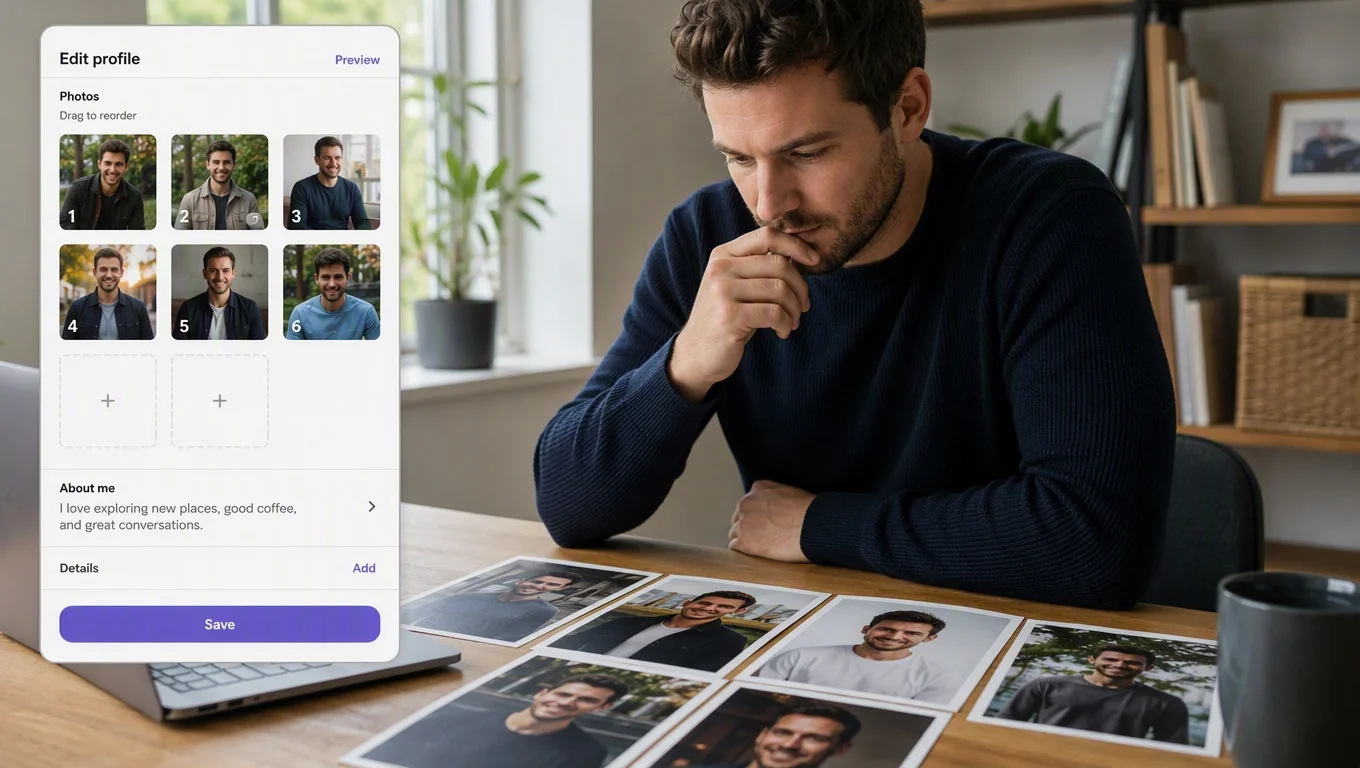
Because of that larger canvas, wider crops work well. A 4:3 or gentle landscape framing lets you include context, a hiking trail, a cafe table, a friend's dog, without cramming everything into a square. You can also upload more photos. Six to twelve is common, and each one can serve a distinct purpose: a clear lead headshot, a full-body shot, an activity photo, and a couple of social or hobby images.
Detail matters more here. Since images render larger, low resolution or heavy compression shows immediately. Aim for sharp, well-lit shots that still look clean when someone zooms in on a 27-inch monitor.
The tradeoff: more slots means more chances to include a weak photo that drags the whole profile down. On a site, one blurry or unflattering image sits in view longer. Curate ruthlessly, and if you want a benchmark for what to keep, our guide to the best dating profile photos that actually get matches ranks the shot types worth your slots.
Transform Your Dating Profile Today
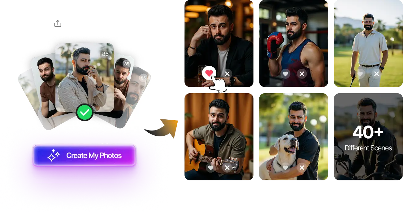
Upload your selfies, get 80-180 AI-optimized dating photos in just 20 minutes. No photoshoot needed.
7-Day Money Back • Privacy-first • One-time payment
Get Started Now →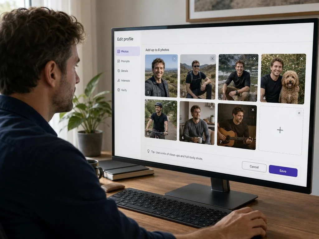
Dating App Photos: In-Depth Look
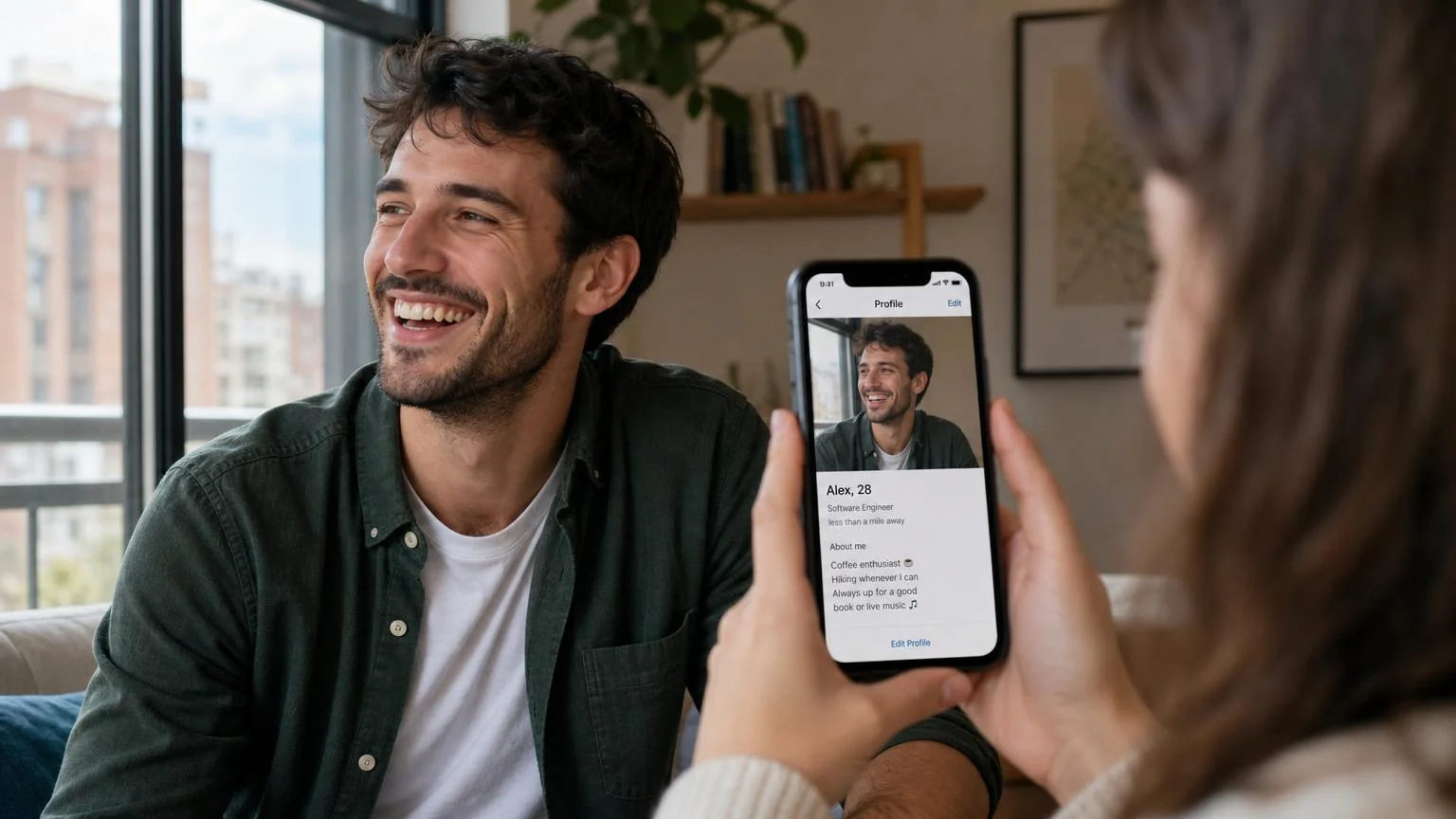
Apps flip the priorities. Your photos appear as cards on a phone, usually a square or tall portrait crop, and viewers make snap decisions. The lead photo carries most of the weight because many people decide before scrolling to photo two.
That means your first app photo must read instantly at thumbnail size: clear face, good light, single subject, no distracting background. Wide landscape shots that shine on a desktop site often get center-cropped on an app, cutting off the edges that made them work. Always preview how a photo looks in a square before you commit.
Photo count is leaner. Three to six strong images usually beat a longer set, because each extra photo is another chance to give someone a reason to swipe away. Order also matters more: lead with your strongest face shot, follow with a full-body and an activity shot, and avoid burying your best image.
App-specific culture varies by platform, and if you want a deeper dive built for phone-first profiles, our complete guide to dating app photos covers ordering and platform quirks in detail. If you're producing new shots specifically for these tight crops, a good set of dating photos built around square-safe framing will save you a lot of re-cropping.
Key Differences That Change Conversion
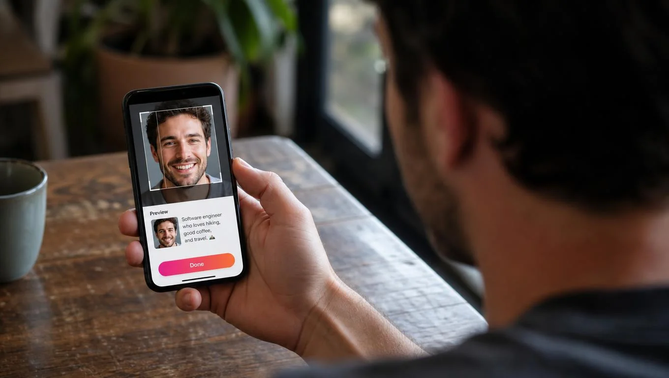
The biggest divide is crop geometry. Sites reward width and context; apps reward tight, centered clarity. A photo composed with your subject dead-center survives both crops, so shoot with a little breathing room on all sides and let each platform crop inward.
The second difference is attention budget. On a site, a viewer might read your bio before judging your photos, so a slightly imperfect image can be rescued by strong writing. On an app, the photo usually wins or loses the swipe before anyone reads a word. That's why your app lead photo is the single highest-leverage asset you have.
Count and order are the third factor. Sites let you tell a fuller story across more images; apps demand a ruthless top three. The mistake many people make is uploading the exact same set in the exact same order to both, which leaves matches on the table on at least one surface. Reorder deliberately for each.
Transform Your Dating Profile Today
Upload your selfies, get 80-180 AI-optimized dating photos in just 20 minutes. No photoshoot needed.
7-Day Money Back • Privacy-first • One-time payment
Get Started Now →When to Optimize for Each
Choose a site-first approach if you're mostly meeting people on desktop platforms like Match, OkCupid, or eharmony, where browsing is slower and bios carry weight. Prioritize wider crops, a fuller photo set, and high-resolution files that hold up on big screens.
Choose an app-first approach if Tinder, Hinge, or Bumble is where you spend your swiping time. Lead with a square-safe face shot, keep the set to your three-to-six strongest, and test the order aggressively.
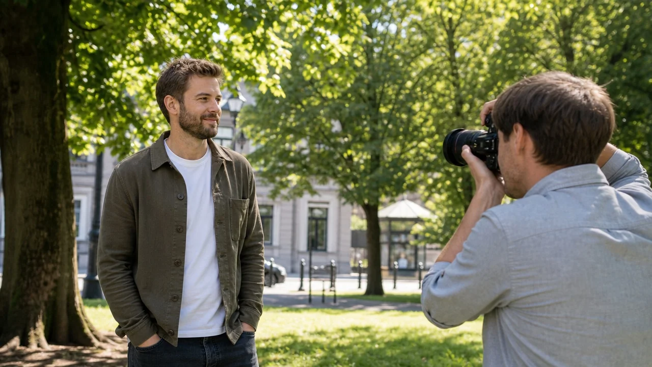
Most people should do both, but from one shoot. Capture centered, well-lit images with room to crop, then export a wide version for sites and a square or vertical version for apps. If you want to check that your face reads clearly at small sizes, our guide to taking dating profile pictures without an awkward photoshoot covers framing that survives both crops.
Who should avoid over-optimizing: if you only use one platform and get consistent matches, don't burn hours re-cropping for surfaces you never touch. And avoid uploading heavily zoomed or edited crops just to force a landscape photo into a square, cutting off your head or leaving dead space converts worse than picking a photo that was framed correctly to begin with.
Our Recommendation
If you're forced to pick one surface to perfect first, optimize for apps, because the tight crop and short attention window are less forgiving, and a photo that wins on a phone almost always still works on a desktop site. The reverse is not true: a wide, context-heavy site photo often falls apart when an app crops it square.
The tradeoff behind that advice is time. App-first optimization means shooting with square-safe, centered framing, which slightly limits how much scenery you can show. If your main platforms reward storytelling and slow browsing, flip the priority. Either way, shoot once and export two crops rather than running two separate photoshoots.
Final Thoughts
Photos for dating sites and photos for apps share the same raw material but demand different framing, counts, and ordering. Sites reward wider crops, more images, and high resolution for slower browsing; apps reward a square-safe lead photo and a lean, ruthless top set for fast swiping. The people who convert best on both simply crop and reorder deliberately instead of copy-pasting one identical gallery everywhere.
Ready to get started? Audit your current lead photo in a square preview first, since that's the single image doing the most work on mobile. If it holds up, reorder your set for each surface and you'll get more from the photos you already have. Save the final conversion step for when you're ready to generate a fresh, crop-flexible set.
Transform Your Dating Profile Today
Upload your selfies, get 80-180 AI-optimized dating photos in just 20 minutes. No photoshoot needed.
7-Day Money Back • Privacy-first • One-time payment
Get Started Now →FAQ
Quick answers to the most common questions about photos for dating sites versus apps.
Are photos for dating sites different from app photos?
Yes. Dating site photos are viewed larger on desktop with wider crops and more slots, while app photos appear in tight square or vertical crops on a phone. The same shot often needs a different crop for each.
How many online dating photos should I upload?
On desktop dating sites, six to twelve works because browsing is slower. On apps, three to six strong images usually beat a longer set, since every extra photo is another reason to swipe away.
Should my lead photo be the same on both?
It can be the same source image, but crop it differently. Apps need a centered, square-safe face shot; sites can use a slightly wider version with more context.
What crop should I shoot for to cover both?
Shoot centered with breathing room on all sides. That lets you export a wide crop for sites and a square or vertical crop for apps without cutting off your face.
Which surface should I optimize first?
Optimize for apps first if you split your time evenly. A photo that reads clearly in a tight mobile crop almost always still works on a desktop site, but the reverse often fails.